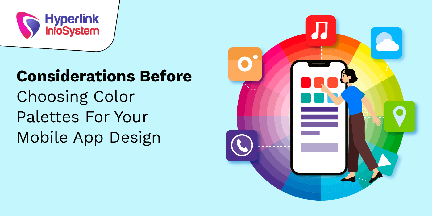
Colors play a significant role in our lives. There is a different psychology all-together when it comes to the way we perceive colors. For instance, some white colors are way too simple and blend, while for others, it’s simple yet sober. The psychology is that some people tend to get attracted to colors rather than simplicity, while others find too many colors distracting to read the actual content.
Which color would you choose for your mobile app -Red, Blue, Yellow, White, or others? This question sounds immature, but it isn’t. Colors affect humans more deeply than is often realized. The color scheme is the heart of your mobile app design and must be taken care of. So, if you are considering developing a mobile app in the near future and thinking about what color you should choose, this article has your doubts answered.
Let’s first know the significance of various colors.
The mobile app designer from
app development company would follow the latest trends while picking colors for the app design, which isn’t a terrible idea. But it should be noted that colors have a profound impact and the power to communicate with the user; hence, it should be chosen carefully.
Red? It implies the call to action and reflects impulsiveness.
Yellow? It displays delight and optimism.
Green? It is related to nature and the environment. It is also linked with money and wealth.
Orange? It highlights enthusiasm and excitement.
Blue? It is a dynamic color and represents serenity and prosperity.
How to Choose Your Colors Correctly?
1. Know your target audiences’ emotions
App colors and user emotions are interconnected. A few colors have vast importance, while others have a unique perception. Hence, before choosing a specific shade for your mobile app, you must consider what it signifies so you can focus on your target audience’s emotions. For instance, if you have developed an app for older people, you might want to reconsider adding too much red color to it, since it calls for action and impulsiveness.
Psychologists have studied how people are influenced by colors and have found an intense relationship between colors and emotions. For instance, brands like KFC, Pizza Hut, Grubhub, and more use red color in their logos to incite hunger. Gold, silver, black, and white are often used in the logos of luxury brands such as Michel Kors, Chanel, Prada, and others to add a sophisticated touch.
Keep the same things in mind while designing the color scheme for your app. Ask yourself what you want to convey to your users about your app with your color palette?
2. Pay attention to your app type
The decision to choose your app’s colors is based on what category your app falls under. For instance, if you plan to develop an app for eatery or beverages, Red will be your preferred color. This is because past experiences and studies have helped guide our reality. For instance, when you have found a serene and relaxing experience by looking at the sea, you relate the calmness to blue color every time. Likewise, if you’ve eaten a lot from food brands with red colors, you associate hunger and temptation when you see the color red.
Social media is another example associated with blue color. All the popular sites like LinkedIn, Facebook, Twitter, WordPress, and Skype are blue. Is this a coincidence or a well-planned marketing tactic? People associate social media with blue color, and looking at this fact, we can say so.
Moreover, blue stands out amazingly with text. It is simple to read and doesn’t take over the entire screen. For example, a yellow would be too bright even to consider noticing on a light backdrop, whereas purple would be too dark, and the content would hardly get seen.
3. Pick the color of your app icon
The app icon is the main thing that your target audience will see when they view your app on Google Play Store or App Store. It plays a significant role in determining if they’ll install the app.
The app icon must show the app’s utility concisely and lucidly. From now on, try to pick a mobile app icon that describes your mobile app entirely. Discover the color scheme that will go well with your brand and tune with the app icon design. Let’s go through some real-life scenarios.
Games mostly use faces as app icons
The game category is filled with characters. 38% of top gaming apps have faces as their icons. A few of them are humans, while others are animals or cartoons. One reason for this is that games need to display the emotions of people in their app icons. This is why most mobile apps have cartoons or faces in their apps icons with vibrant colors.
Blue is the preferred color for app icons
Blue is the most adopted color that makes up for 1000s of logos. According to research, 23% of top mobile apps in the app store has blue as its primary color after red and white, each with 13%.
The right uniformity in the app’s icon design and the color scheme will nail your app’s design. The color of the icon should be used as the base color for the entire app for branding purposes.
Now you’ve got a basic idea of how to use colors in your mobile app to make it look attractive. It is necessary to use the right scheme colors to make it look attractive because you cannot just use one color. A perfect app is that uses the right blend of colors to complement one another. You can do this by using multiple mobile app color schemes.
Final Thoughts
The visual appearance is what attracts your users to use your app apart from usability. The UI and UX design of your app come into light when the user’s value the appearance of your app. Hence, be careful and use this information to wisely choose your color scheme and mobile app color themes to enhance your mobile app design. A perfect color palette can make your app stand out from your nemesis.
