Creating a clean and organized navigation menu can be difficult. The task becomes more complex when it is an exclusive app for mobile devices due to the limitations of the screen size. In response to the needs of users on these devices, various patterns for mobile navigation have emerged over the years. Let’s talk about the most common browsing patterns used on
mobile devices.
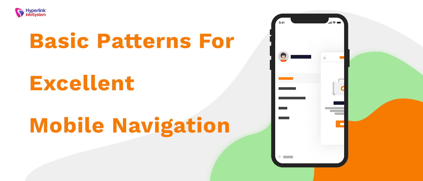
Hamburger menu
Due to the limited screen space on mobile devices, the hamburger menu icon is one of the most used browsing patterns today. This useful three-line icon indicates that the menu is "hidden" and will only be activated when the user selects the icon.
Advantages
- Frees screen space so the user can focus on the main content
- It can be used to organize a large number of sections in a minimum space
- Prevents users from feeling overwhelmed by minimizing available sections
Disadvantages
- Since the menu is minimized, users are less likely to use it. It remains visible, but they will concentrate on other elements on the screen.
- Extra steps are required to reach the desired section since the menu must be activated to see all the options.
Effective Usage
Since this type of pattern hides the menu, it is not very effective in applications where the user continually needs to change the section, as in the case of an online store that has a wide variety of products. This does not imply that this icon is not useful. It can be very helpful when using it as a secondary navigation as is the case of dedicated applications such as Uber where the greatest interaction is on the home screen and links associated with it. The menu is used as a kind of addition in which the user can visit secondary navigation options as the main actions can be performed without having to access this menu.
Tab Bar
This type of menu has been inspired by the design for computers. It usually contains a few links, all of them are of equal importance and therefore, direct access to them is required. Although it is possible to place text only, you can also place icons and text to reinforce the message visually.
Advantages
- Communicate where the user is because the icon or link is usually highlighted once selected. In this way, the user immediately understands his current position
- It is always visible no matter what page or section the user is viewing.
Disadvantages
- The navigation options are limited. Although it is possible to place a good number of options in the bar when making it slide, the links that are not visible lose importance and would stop being a direct navigation.
- In Android, placing a tab bar at the bottom can be problematic because that's where the navigation controls of the operating system are located. It is much simpler to touch these buttons by mistake if placed in this position.
Effective Usage
Browsing in tabs is a perfect solution for applications that have a minimum number of navigation options (up to 5 would be the maximum) so that all these can be visible on the home screen. In this way, they are activated in a single touch, unlike the hamburger menu.
Floating button
This circular button literally floats on the interface. It is usually placed at the bottom of the screen and is visible no matter how much the user moves around the page. When this button is selected, it looks like it will be raised or enlarged slightly. It is an element that is commonly used in Material Design.
Advantages
- It occupies a minimum space on the screen.
- It is an indicator of the main actions you want users to take.
- It captures the attention of users because it is an element that is in the foreground.
Disadvantages
- Since it is colorful and is in the foreground, it captures the attention of the users and in some cases, it can distract the users from the main content of the application.
- It can block important content that users need to visualize as it is placed in the foreground. In this way, the user must scroll down to see the information hidden by the button.
- It works only with icons. Due to its shape, it has been chosen to place only one icon. This icon may vary depending on the app as developed by
app development companies, but it can be confusing for users as it does not offer context. Usually, it is used with a pencil or with a symbol of a sum, but the meaning can vary enormously between different applications.
Effective usage
This button focuses on the usual actions that the user can take. It is a kind of indicator of what the user should do or the available options. For example, in a music app developed by app development company, the most common is that if a floating button is placed, it contains the "play" icon.
Since it is striking, users cannot avoid interacting with it and can perform specific actions in one or two taps on the screen.
Full-screen navigation
Although all the previously described patterns focus on minimizing the space used on the screen, this type of navigation does exactly the opposite: it occupies the entire screen. In this way, the user focuses on navigation until choosing an appropriate or interesting option. It may contain additional options that are revealed once the user has selected the section that interests him.
Advantages
- The user focuses all his attention on the menu once it has been activated.
- You can organize information consistently without overwhelming users.
- Once the user has decided which section to go to, you can dedicate all the space on the screen in specific content for that section.
- You can organize several levels of navigation and indicate them by means of arrows or drop-down.
Disadvantages
- You are limited to showing only the navigation options until the user decides the section he wants to visit.
Effective Usage
This type of navigation is ideal when users usually limit themselves to visiting only a specific section of the application each time they enter. Also if you have a large number of sections in the navigation as it is revealing information little by little, you avoid overwhelming users.
Conclusion
Navigation is a relevant issue, both in computers and mobile. Due to the limited space of the screen,
mobile navigation options have been searched and new patterns have been developed that have surprised users at first. But due to the use of these patterns in other applications, they have easily become accustomed.
In certain cases, it is possible to use different patterns in a single interface. For example, combine the use of navigation tabs with a floating button to highlight the main action that you want the users to take.
