�
Call-to-action buttons are elements that are directly associated with the conversion rate of a website. These useful buttons should stand out in the design and offer a clear message that indicates a certain result if the visitor decides to click. For example, it can be "Subscribe to our newsletter" or "I want free content." Since the sentence must be short, but you must think carefully about it.
Additionally, you must take into account the color, position, shape, and location of these small buttons. So, as you can see, placing a call-to-action button is not as simple as it seems. But you may see examples of call-to-action buttons used effectively and even creatively on a website, have enough inspiration to solve certain questions about your own CTA button. Therefore, in this article, we show you some of our favorite CTA buttons.
Netflix
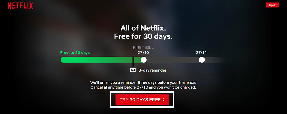
The first thing that visitors see when they visit the
Netflix homepage is a collage of various series available on this platform. Dark colors are used so that both the title and the subtitle are highlighted when used in white.
Its CTA button is red, one of the most striking colors in the color circle. Also, this color aligns with your corporate identity since its logo is red. The phrase indicates that you can use the free service for one month. No doubt this is a detail that arouses the interest of many visitors.
Wellington Zoo
The
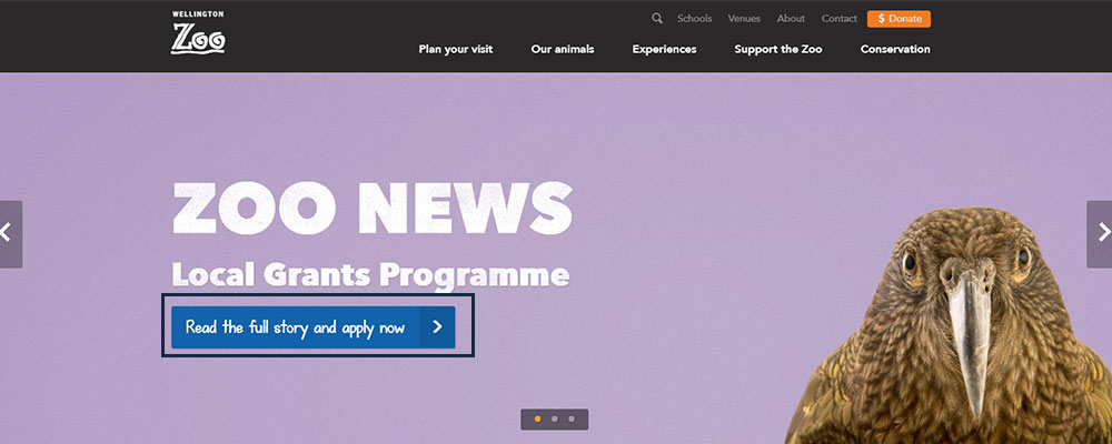
home page of this zoo is quite colorful, indicating fun. In the foreground, we see a chameleon that, by its colors, combines with the yellow chosen as the background. A title is used with a font of thick and capitalized canes that says "Know our wonders", clearly referring to all the animals that the zoo houses.
The CTA button is aligned with the title and is a violet tone that is considered complementary to yellow. In this way, complementary color contrast is created, ideal for use so that foreground elements stand out from the background.
Skype
The
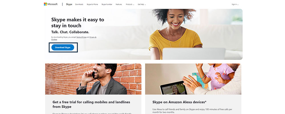
Skype page uses an image as a background, the source of the title and subtitles are white. In the case of the title, there are no readability problems because it is in higher scores, but in the subtitles, there are possibilities to differentiate the message.
Unlike the previous examples, on the first screen, you can see three CTA buttons: one in the menu bar and the other two under the subtitle of the home page. However, because of its size and because it has a fill color, the button that says “Download Skype” stands out because, although they have a way to use this online service, what is finally desired is to download and use the program.
Grammarly
In
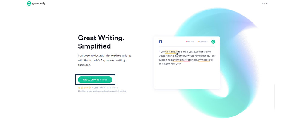
Grammarly web page, a reddish tone has been used for the CTA button. It indicates in the message "Add to Chrome" which indicates that it is an extension or plugin for the web browser. Additionally, they have added the phrase "It's free" to get attention and increase the conversion rate. Another additional detail is that the button changes according to the browser you are using as this extension is also available for other web browsers. Finally, the button is placed in the menu bar once the user scrolls down to learn more about this extension. In this way, if the user finishes reading the benefits that interest him most and wishes to download the plugin, he should not upload again.
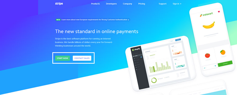
Stripe
Stripe website greets its visitors with a background in different blue tones. The title has been aligned to the left as images have been placed on the right side. In the first screenshot, you can see two call-to-action buttons, one to create an account on the platform and another to learn more about the operation and benefits of this service.
It is sensible that both buttons have been placed because being the first image on the home screen, it is unlikely that visitors decide to create an account immediately, except if they have already heard about the service before. They are much more likely to choose "Know our offer", but there is a percentage that could create an account directly, so it is good to offer both options.
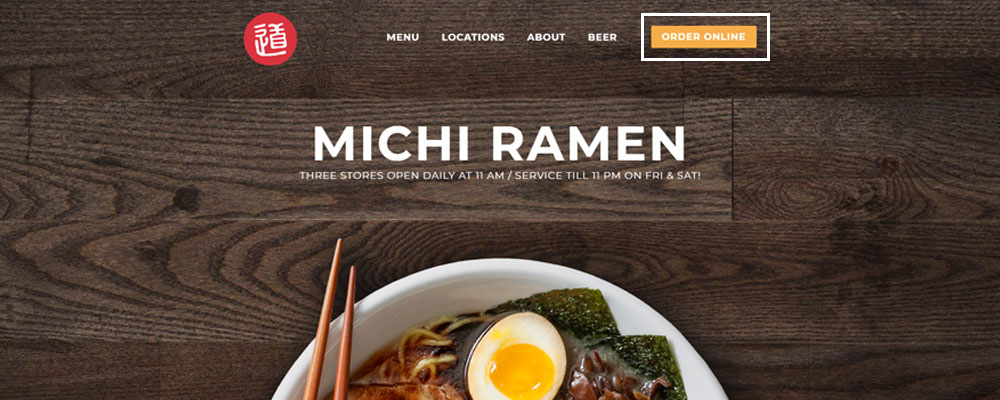
Michi Ramen
This page from
Michi Ramen has a clean design that could even be considered minimalist. The title of the page is nothing more than the name of the restaurant and its logo has Japanese characters. The text under the title clarifies the type of business it is and also the image that has been placed as a background is a fairly clear indicator that it is a Japanese food restaurant specializing in ramen.
The CTA button has been placed in the menu bar on the left side probably not to interfere with the full display of the image. And in this way, the button remains visible regardless of whether the user goes to another page of the site. In this way, they increase the possibilities of conversion because the visitor can be convinced to order online once they have visited the menu page or when seeing the different places that this restaurant has.
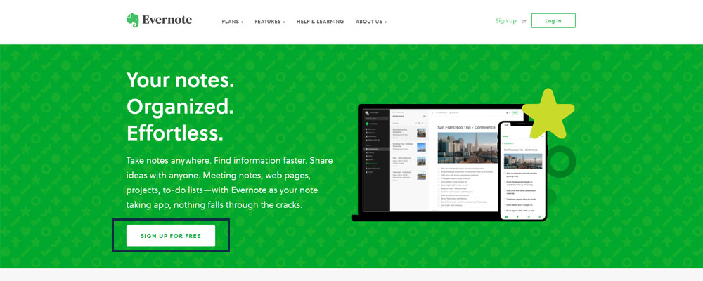
Evernote
The
Evernote page is another example of call-to-action buttons used effectively because on the home page, you not only see the button to register, but it immediately offers you a form so that you can register directly, without having to click on a button that will direct you to a form. This same page offers the option of registering with a Gmail account so that users who want to connect other services to Google can opt for this option.
The registration button is green, the same tone as seen in its logo. As a background on the page, a video has been placed.
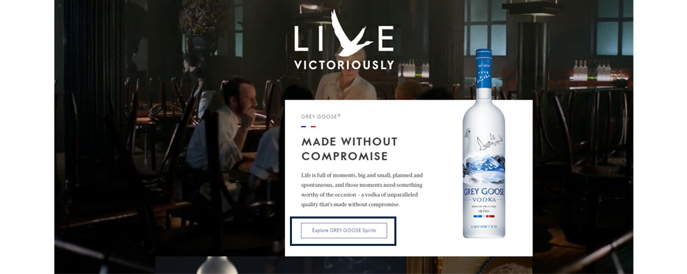
Grey Goose
The
Grey Goose homepage is divided into sections, each of them has a different photograph but related to the brand. In each of these different sections, a CTA button has been placed with a different message according to the section being observed. All buttons are phantom style, which aligns to the overall design of the page.
Although the buttons are not as huge as usual when using this style, they differ considerably from the background due to the color used to delimit the area where they are located.
Call To Action is something that do a big role in term To design your website or app more interactive and increase the rate of conversions, well-designed Call-To-Action button by top
app developers is must for any website or app development. Hope you find this information helpful for your next app or website needs!