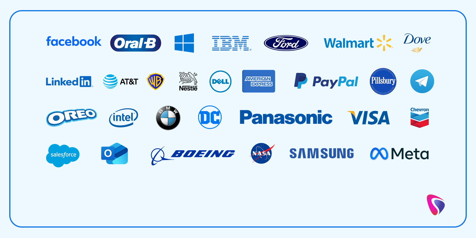
Customers love great products, but they only realize it after buying/using them. Colors and logos make the first impression. 75% of customers recognize a brand by its logo. This is why business owners must carefully choose their logo. Once they choose the logo, it becomes their identity. Not just the design, but the logo’s color matters too. 43% of Fortune 500 companies have blue logos. Why do many companies have blue company logos?
This indicates a preference for a certain color. Is this just to grab the customer's attention, or is it to project a certain image? Companies may use blue logos because they saw it work for others. Or the color aligns with their company’s vision, offerings, or its qualities. Whatever the reason, companies should always choose an appropriate color for their logos. However, companies should remember that choosing a logo color is very important. An attractive, unique, and colorful logo registers in people’s minds.
Another reason is that once a company chooses a logo, people associate the brand with it. Changing the logo may cause companies to lose trust or familiarity. That said, blue remains a favorite color for logos. Whether it's retail, healthcare, consumer products, or food companies, many of them have blue logos. In this blog, we will discuss 30 famous brands with blue logos. No more waiting. Let's get started.
Why Do Companies Choose Blue For Their Logos?
Below are some reasons why companies choose the color blue for their logos.
1. Psychological Reasons
- Blue company logos build trust and reliability. They instill confidence in clients and make people feel safe. Most banks, tech firms, and healthcare brands use blue for their logos.
- Blue is usually associated with peace and tranquility. People imagine oceans and blue skies whenever someone mentions blue.
- People also link blue with intelligence and efficiency. Many corporate and tech companies use it.
2. Cultural Relevance
- Most cultures have a positive view of blue. There are almost no negative connotations associated with it.
- The sky and water bodies are blue. Blue appeals to a massive global audience.
- If you observe, international companies such as Facebook and IBM have blue logos. These companies have a presence in most countries of the world.
3. Professional and Corporate Identity
Most colors convey a certain emotion. Below are some examples.
- Red - Passion, energy, love, or danger.
- Yellow - Joy or happiness.
- Blackness - Sadness or mystery.
- White - Peace, truth, or purity.
Blue conveys authority, which is a powerful authority. Note that this authority comes without aggression.
4. Backed By Science
People trust a brand that has blue in its brand/logo. Chances are that people will relate to such brands and buy from them. Both men and women have a liking for blue.
5. Ideal for Designs
Blue looks great on digital platforms and device screens. It also works well with other colors, such as white or gray. These combinations are great for modern and minimalistic branding. Whether it's a light or dark background, blue blends perfectly. Even with dark themes, blue manages to stand out without hurting one’s eyes.
Want to design a unique and impressive logo for your company? Consult a professional logo design service provider in your location.
30 Famous Brands With Blue Logos
Below are 30 brands that have blue logos. These brands are known by millions of people across the world.
1. Facebook
There is an interesting story about why Facebook has a blue logo. Apparently, Mark Zuckerberg has red-green color blindness. Blue is the easiest color for him to distinguish. Although this reason is personal, it's well-known that blue is associated with trust, stability, and calmness. Other attributes attached to blue include communication and interaction. This may be the biggest reason why Facebook’s creators chose blue for its icon. Additionally, the blue and white color scheme has a global appeal. It will have an aesthetic appeal for different devices and platforms.
2. Oral-B
Oral-B is a dental hygiene brand that sells a variety of products, including toothbrushes and toothpaste. In order to sell its products and create a clean image, it must have an appropriate logo. Hence, Oral-B’s logo has a blue background with the text in bold white. Also, blue is associated with the sea and sky. It denotes freshness and a global reach. The blue and white color combination is professional and portrays a positive image for oral care products.
3. Windows
Another famous company with a blue logo is Windows. Windows is an operating system. Previously, the logo had four different colors. Now, four blue squares have become its logo. The Windows logo signifies the window to a new world, full of creativity and innovation. Additionally, the color blue denotes many qualities. These qualities include stability, calm, and trust. It's not just the operating system: Windows also uses the blue logo for its other products.
4. IBM
One of the brands with the most iconic blue logos is IBM. IBM’s logo is unique, and it’s not just because of its blue color. Its design is unique too. If we look at IBM’s logo, it has a white background with bold and capitalized letters. Many horizontal stripes run through the capitalized letters. Below are the attributes associated with the patterns and colors.
- Horizontal Stripes - Speed, technology, innovation, and data flow.
- Blue - Trust, professionalism, and progress.
- Design - Simple, modern, and elegant design.
5. Ford
Ford is a renowned brand with a blue logo. Almost everyone would have heard of Ford. The text in the logo is white while the background is dark blue. Plus, the white text is encircled with silver accents. Everything has a meaning.
- Blue Background - Reliability, Trust, Excellence, and Strength.
- White Capital Letters - Purity and Elegance
The silver-like circle present in some older Ford vehicles emphasizes the craftsmanship that went into creating them. It's not just the color; the entire design has some spectacular elements. Be it the bold white letters or the cursive writing system, all of it signifies eloquence and sophistication.
6. Walmart
Walmart’s logo uses a mix of blue and yellow color scheme. This color combination symbolizes trust and optimism. The yellow spark icon represents innovation and aligns with the company's values. What feelings do these colors invoke?
- Blue - Reliability and professionalism
- Yellow - Warmth, energy, and amiability
Walmart employees refer to the six-rayed spark as the sparkle. The sparkle stands for the guiding principles of Walmart, which are integrity, community, innovation, and focus.
7. Dove
Dove is a reputed personal care brand that manufactures products such as soaps, deodorants, shampoos, and more. The text appears in blue and is written in cursive. It speaks volumes about the brand. While the text stands for premium care and sophistication, the golden dove denotes care, purity, and luxury.
8. Samsung
Being one of the world’s largest technology companies, Samsung needs no introduction. It holds a 19% global market share in smartphones. Merely hearing the name Samsung sparks a feeling of trust and confidence in people. Bold white text in an oval conveys a feeling of innovation, stability, and global appeal. The typography signifies a simple yet futuristic approach.
9. LinkedIn
LinkedIn’s icon features a bright blue hue and bold white text. This combination signifies trust and professionalism. Bold sans-serif text with slightly rounded edges is neither too assertive nor too friendly. It strikes a perfect balance for a professional networking platform. At the same time, the logo is not too plain or flashy. The blue background inspires confidence and clarity, which are much-appreciated traits in the corporate world. The small “in” text inside a blue square grabs the attention of anyone, whether they use the desktop version or the app. Last but not least, the logo also does not cause distractions.
10. Unilever
Unilever is a reputable consumer goods manufacturer based in the UK. Since it makes goods for people, its logo must convey feelings like purity and trust. The logo does exactly that. The U-shaped symbol in the logo represents various aspects of its offerings. These offerings include food, beauty, personal care, and more. The fonts below the U-shaped symbol are simple and minimalistic, not taking away the focus from the symbol.
11. AT&T
The AT&T logo is a 3D globe with curved lines inside it. These lines signify creativity and global reach, along with giving the logo a futuristic look. The company management chose the color blue because it had to connect with a global audience and earn their trust. Meanwhile, AT&T’s clean and simple fonts are easy to spot and read. The globe design denotes its global reach and innovation in the digital sphere.
12. Warner Bros.
The Warner Bros logo is a combination of blue and gold colors. It conveys the feeling of prestige, excellence, and cinematic splendor. If we talk about the design, the initials WB are engulfed by a blue background outlined by a golden strip. The bold and custom serif fonts appear majestic and ooze confidence. People look at the logo and instantly recognize the organization. Overall, Warner Bros’s logo combines strength, tradition, and simplicity to leave an everlasting impact on anyone who sees it.
13. Nestle
Nestlé manufactures food and beverages. Using a combination of blue and white in its logo, Nestlé represents care and trust. The logo depicts an image of a bird feeding her hatchlings in a nest. So many emotions in a single image. Not only does it symbolize motherly love, but it's also about family, nourishment, and protection. Additionally, the fonts are simple and modern, making it ideal for a global giant. By blending family values and emotions with a corporate appeal, Nestlé’s image is recognizable worldwide.
14. Dell
Dell is an American computer technology company. It specializes in making, selling, and repairing a wide range of products such as laptops, desktops, SSDs, and more. The clean and simple fonts are easy to read. Note that the E in DELL is placed slantingly. This makes the design unique and attractive. Not only is it unique, but it also signifies innovation and out-of-the-box thinking. The blue and white combination in the logo ensures friendliness without compromising professionalism.
15. American Express
The American Express logo uses blue and white colors. The background is blue while the letters are outlined in white. Together, this combination conveys trust and financial stability. The fonts are bold and easy to read for people (on diverse devices and platforms). Moreover, the combination of colors and fonts gives it a secure yet modern appeal. All in all, American Express’s logo is uniform and stands out.
16. PayPal
PayPal’s logo uses two shades of blue, but that’s not the interesting part. The interesting part is that the logo has two overlapping Ps at the start. Two overlapping Ps are followed by the text PayPal in bold blue. Overlapping P’s connect and secure transactions between two parties. Additionally, the fonts are easy to read and view on different screens. In conclusion, the blue color denotes safety and trust, which is crucial for an online payment company like PayPal.
17. Pilsbury
Pillsbury is an American company that makes and sells dough and baking products. The main color of Pillsbury’s logo is blue. The letters are in a stylish serif font that looks stylish yet comforting. While the blue color conveys trust and warmth, the white adds a touch of comfort and purity. A circular dotted badge around the text stands out from competitors. It assures people of the product’s quality and earns their trust. Lastly, the smiling Pillsbury Doughboy mascot invokes friendly and happy feelings in people. Most people will look at the logo and trust Pillsbury products.
18. Meta
The Meta logo is an interesting piece of art. It looks stylish, like the digit 8 written sideways. The unique design, combined with the color blue, symbolizes trust, connection, and the digital world. Although the logo looks like the digit 8, it's an infinity loop shaped like the letter M. The font has a modern feeling and is easy to read. Besides the font used for the logo, the white background creates a peaceful and balanced aura.
19. Oreo
Oreo is a company that makes sandwich cookies. It has a logo that uses bold white letters surrounded by dark blue. The text is in a rounded sans-serif style. It induces a playful feeling while being easy to read. The combination of blue and white is mysterious, just like the Oreo cookie. Being crunchy on the outside and creamy on the inside, Oreo’s logo complements the product completely.
20. Intel
Intel uses a blue logo, but it stands out completely. Although the color is blue and the background is white, the fonts and the design steal the show. Modern, rounded sans-serif interface reflects simplicity and professionalism. An older version of the Intel logo had a circular swoosh. The newer version is simple yet professional. The dot over the letter i is light blue in color, while the other parts of the text are in dark blue. In short, the Intel logo blends modernity, precision, and friendliness. It also portrays the brand as a game-changer in innovation.
21. BMW
BMW uses three colors in its logo, including blue. The other colors are white, black, and silver. These colors are from the Bavarian flag. The logo is a circle with the outermost layer. Not only does this black layer add contrast and strength, but it also conveys authority. The text in this circle is readable and simple. The inner circle is split into 4 parts with blue and white colors.
22. DC Comics
DC Comics has a logo with blue and white colors. A logo for comics must be attractive and mysterious. The combination and white denotes creativity, strength, and imagination. These are excellent traits for storytelling, especially when the comics show superheroes as larger-than-life figures. The bold and modern sans-serif font is simple yet powerful. The letters DC are inside a circle, which invokes a feeling of unity and protection. The overall design and color combination of the DC Comics logo represent the vision and imagination of the company.
23. Panasonic
Panasonic is a world leader that manufactures electronics, home automation, and other products. Its logo is quite simple. The background is white and the fonts are bold and dark blue. The dark blue color signifies the commitment to excellence and innovation. Simple and bold fonts signify simplicity without flashiness. The simple and clear logo makes Panasonic distinguishable on diverse products and platforms.
24. Visa
Visa’s logo is blue, and the text is in bold letters. Many of its products also have a touch of gold. The combination of blue and gold makes Visa stand out. At the same time, the design is unique and modern. While the blue color symbolizes trust and professionalism, the gold signifies wealth and prosperity. The fonts are simple and easy to read. Overall, Visa’s logo is unique, professional, and encourages people to engage with the brand.
25. Chevron
Chevron is a major oil and gas company in America. Its logo has blue and red colors. Blue represents stability, while red stands for progress. The design is also special. It shows two blocky V-shaped shapes stacked on top of each other. One of them is red and the other one is blue. The simple design and bright colors help people spot the brand easily.
26. Telegram
Telegram is a popular messaging app. The logo has a blue background with a paper plane in the middle. The blue logo signifies open communication and clarity. On the other hand, the white colored plan in the middle denotes freedom and speed. Minimalism is the biggest strength of Telegram’s logo. On the whole, the combination of blue and white exudes simplicity and reliability.
27. Salesforce
The Salesforce logo is in the form of a blue cloud. Blue with white lettering stands for cloud computing, reliability, and scalability. The text inside the cloud is white, and the sans-serif fonts denote friendliness. At the same time, these fonts are easy to read across different screens and platforms. If we talk about design and colors, the blue and white color combination creates a clear contrast. It captures people’s attention, enhances visibility while earning trust.
28. Outlook
Outlook uses blue and different shades of it. Blue denotes trust, clarity, and professionalism, making it an ideal choice for a corporate email tool. The fonts are simple and easy to read. The logo is in the shape of an envelope and has a capital O written on it. Besides making the logo unique, the logo also conveys messaging and organization. The color combination of white and blue balances clarity, professionalism, and daily use.
29. Boeing
Boeing is another reputable company with a deep blue logo. The color blue symbolizes trust, vast sky, and stability. The font is stylish and conveys an impression of motion. Also, the emblem represents a planet with a curved ring, which is inspired by flight. The combination of blue and white colors looks simple yet professional.
30. NASA
NASA has a blue spherical logo. Many people refer to it as the meatball for two reasons. Firstly, the logo’s appearance resembles a meatball. Another reason is its connection to the American Navy’s landing system. The USA’s optical landing system for aircraft carriers is also called a meatball.
The blue background represents the vast sky, while the white dots in the logo are the stars. Blue also stands for NASA’s commitment to discovering the mysteries of the cosmos and scientific research. Additionally, the red chevron and white letters reflect the patriotism of its employees.
Conclusion
Blue logos are classic and have been used for many years. Some of the biggest companies in the world use blogs for their logos. Color alone is not enough, though. Logos must be unique, elegant, and reflect the personality of the brand.
Do you want a blue logo that makes heads turn and lays the foundation for an illustrious future? Partner with a top web development company and witness the magic.


